
A user decides to remain on your website in just 5 milliseconds. This important is the design of a web page. The web design will transmit a message about your brand and will influence how your brand is perceived by users.
- 94 % of the first impressions come from the design of your website.
- 75 % of the credibility of a website is caused by design.
- 73 % of companies invest in design to differentiate their competition brand.
Our web design and creation process
In our approach to create web pages, we strive to offer a more complete service than competition, focusing on three fundamental pillars: quality design, reliable hosting and exceptional support. Each step of our process adapts to provide the best experience to our customers and its users.
At each stage of our process, our goal is to provide a high quality website that meets your needs and expectations, guaranteeing an effective and successful online presence for your business.
Our Fundamentals of Web Design
be clearly distinguished in web design: usability, accessibility and aesthetics. The three perform equally crucial roles, since a functional but unattractic website will not be able to inspire confidence or project a solid brand image. On the other hand, a website with a good aesthetic but with a complicated navigation or a poor user experience, will not only frustrate the user but will be unable to convert visitors into customers.
Aesthetics
The first step will be to determine the type of web design that will be applied to the website. The type of design will be determined by two factors:
- The brand image. It will be of great help if the brand or customer has a consolidated brand image. The main elements of the brand image are the logo, the color letter and the typefaces.
- The end user or target audience. The visual language and the type of content will be different depending on which target audience.
Usability
Web usability refers to the extent to which a web page allows users to access and navigate it intuitively, simple and fast. To evaluate web usability, the following aspects are considered:
- Efficiency: It refers to whether users can meet their expectations or needs effectively. For example, if you can find and read the characteristics of a product or service.
- Efficacy: It implies if users can achieve their objectives in a short period of time. For example, if you can find and read the characteristics of a product or service in the lowest possible number of clicks.
- Satisfaction: It is related to the user's perception about the ease, speed and effectiveness of your experience when navigating the website.
Accessibility
Web accessibility is a fundamental aspect that involves the creation of websites that can be used by a wide variety of people, including those with disabilities. To achieve accessibility, it is essential to have a responsive web design, which means that the site must be able to visualize correctly in any type of device, adapting to the different needs and capabilities of users.
In the end it is important to ensure that the website we believe obtains consistency and a distinctive image, achieving a visual balance between all graphic elements (colors, graphics, funds, typographies), that is intuitive and easily accessible to the contents that interest the user, and that it is accessible, adapting to the different needs of the users.
The key web design elements
The essential web design elements are visual hierarchy, color game and typographic choice.
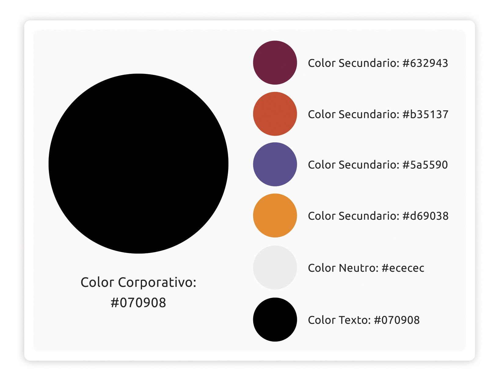
The color palette
Each element corresponds to its color, we cannot apply the same color to all the elements. We usually start from the logo and from there we choose the primary, secondary and neutral colors.
I will put our color letter as an example:
in our case I have chosen a range of colors that transmits strength and dynamism. The quantity and variety of secondary colors responds to cover the large number of sections and content that Gow.tech , which must be differentiated and highlighted by themselves. However, aware that they are very strong colors and that their abuse can tire the user's view, they are used on very small surfaces leaving the neutral colors that do their work: relax the user's view while secondary colors catch attention.
Suppose you have a pink logo. According to color theory, the complement would be green to achieve a visual contrast. However, if all design elements are limited exclusively to pink and green, without incorporating neutral or secondary colors that complement the palette, the result can be exhausting for the user's view. The constant use of these two contrasting colors can cause visual fatigue and reduce user experience.
The same happens when we only choose neutral colors. The result is monochromatic and no element stands out on another.
Web Typography
When it comes to the design of a website, including blogs and landing pages, the creativity and quality of the content is not enough; It is also essential to choose a typography that combines aesthetics with functionality to transmit information clearly to visitors.
What do we have to consider when choosing a typography?
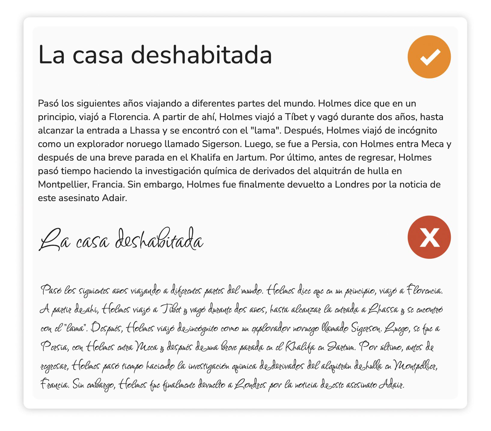
- Opt for a typography that is simple for the eyes, the reading experience will be pleasant and will avoid visual fatigue. Avoid ornate fonts.
- The choice of typography must be aligned with the identity of your brand to avoid confusion in the visitor's perception. Typography should reflect your style. To transmit elegance and simplicity we will opt for a typography without serif. We will use a serif typography if we want to express a more traditional and conservative approach.
- Types can also create a significant visual impact and are as important as images on your website.
Visual hierarchy
The visual hierarchy is a fundamental principle of design that involves organizing the elements of an interface according to its relevance, with the aim of making the interaction easier and easier for the user.
An adequate visual hierarchy plays a crucial role in simplifying the understanding of the information presented and by directing the user's attention towards the actions that are intended to promote or highlight. In essence, it is effectively to guide the user's experience within an interface by giving visual priority to the most important or relevant elements.
The elements to build a visual hierarchy would be:
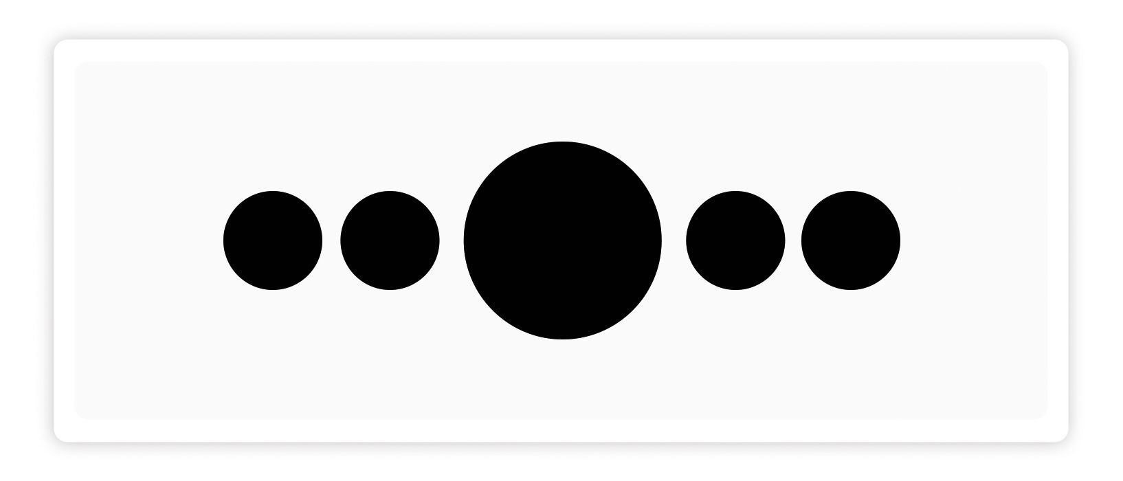
- Size: The size of the elements immediately attracts user attention. Using size as a hierarchy tool allows us to guide the way users process the content. This implies that the largest elements, such as headed, are the first to capture attention, followed by the smallest elements.
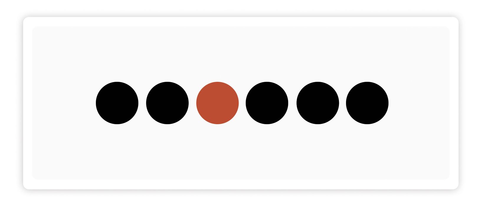
- Color: The brightest and most vibrant colors attract attention effectively, we can use them to highlight certain elements over others.
- Alignment: The elements that deviate from alignment stand out visually. Align elements consistently creates an order on the website, which is essential to achieve clean and coherent designs that facilitate the user's understanding on our website. However, sometimes strategic, breaking this alignment can be used to attract user attention.
- Repetition: The elements designed in a similar way are perceived as related or of equal importance. For example, headers of the same level must maintain the same size, color and style for the user to identify them easily. This consistency contributes to a more effective understanding and navigation of the interface.
- Proximity: User's attention tends to move from the current element to the next one. To create an order of reading or attention, it is essential to group elements according to the desired sequence. Proximity allows to organize the information and establish clear hierarchies on the website.
- Empty space: The empty space surrounding an element makes that element stand more for the user. In addition, it provides a visual respite in the interface, avoiding the feeling of overwhelming. When isolating elements with empty space, they are given a higher hierarchical position and user navigation is facilitated by allowing it to move from one element to another in an orderly manner.
Tools and technologies
Border Technologies:
Brontend technologies focus on the creation of user interfaces and establish communications with the server. These technologies include the following:
- JavaScript: It is one of the most widely used web technologies in the Brontend field. This multiplatform programming language allows us to provide greater interactivity and dynamism websites. JavaScript offers a wide range of functionalities, such as the creation of animations, the manipulation of objects, the validation of forms, the intuitive modification of web elements and the management of cookies. In addition, JavaScript is the basis of powerful web applications such as Facebook or Twitter, which makes it one of the leading technologies in current web development.
- HTML: It is another fundamental pillar in web technologies and is used as a marked language for the creation of websites. It consists of a set of labels that are used to structure and describe the content of a web page. HTML is responsible for defining elements such as paragraphs, images and more. In essence, HTML is used to represent the information and structure of a website. Therefore, it is an essential skill for any web developer.
- CSS: It is a technology widely used in web development, especially by graphic designers. CSS (Cascading Style Sheets) is mainly used to control the visual appearance of HTML elements. It allows to define how the labels generated by HTML should be displayed and present. In other words, CSS is used to style and design to a web page, which makes it an essential tool to improve the visual presentation of a site.
These three Frontend technologies are fundamental in modern web development and play a crucial role in the creation of attractive and functional websites.
Content Management Systems (CMS)
A CMS, which means content management system, is like a magical tool that helps you create and maintain a website without being a programming expert.
Instead of starting from scratch and writing the entire code for your website, a CMS is responsible for complicated parts, such as the creation of pages, image management and other technical tasks. This means that you can concentrate on what really matters: the content of your website.
In addition to websites, there are also CMS for other tasks, such as organizing and managing documents in a simple way.
In Gowtech we work with Ghost:
Ghost is a content management system (CMS) based on Node.js and stands out for its suitability for the creation of online blogs and publications. What really makes it special is its simplicity, its open source nature and, above all, its exceptional load speed.
One of Ghost's outstanding characteristics is its content labeling capacity, which allows us to organize and categorize our website according to our specific needs. This means that we can create a wide variety of categories, sections, formats and content flows that perfectly fit our goals, including options for the home page, custom URL structures and support for multilingual content.
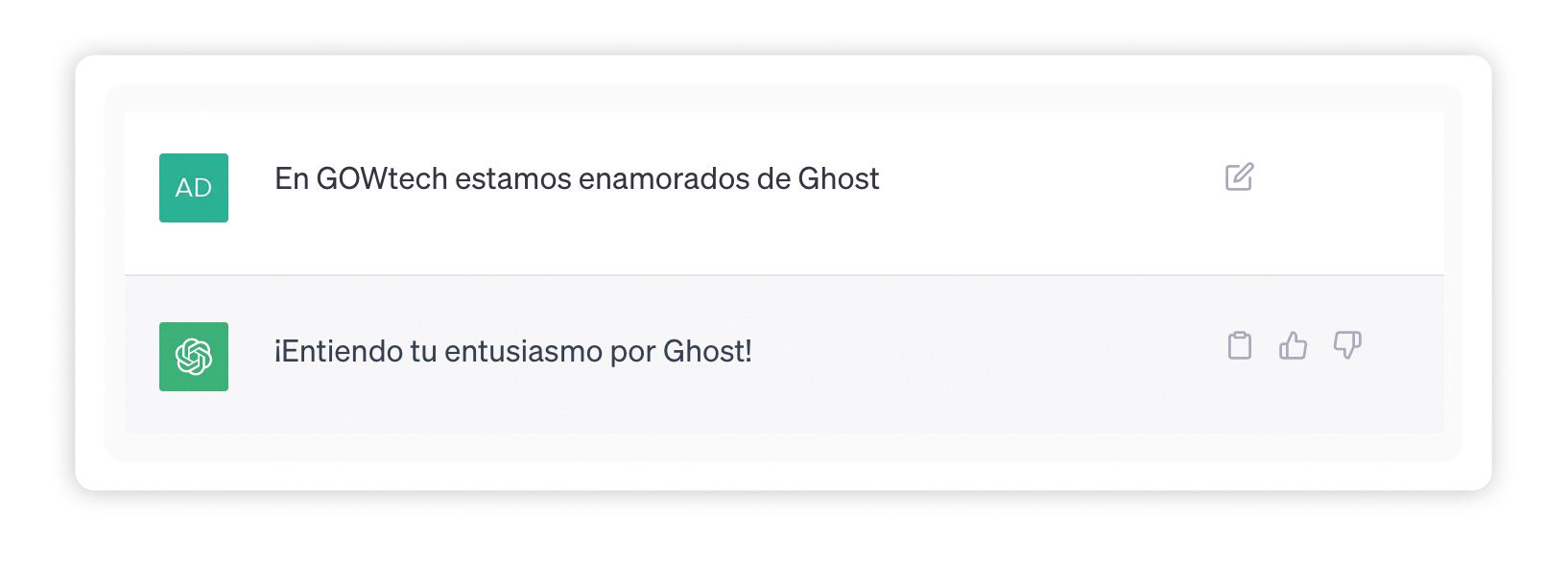
While it is true that WordPress offers a wide range of options and plugins, this versatility can slow down the site. With Ghost, we get all the essential functions we need and, in addition, we enjoy an additional load rate. This speed not only pleases visitors, but is also appreciated by Google, which improves visibility in search results. 😍
Evolutionary trends in web design
Current trends in Web Design continue to flag minimalism and animations.
The role of minimalism in web design
It is common to meet websites crowded with disorderly information, ads and distractions. This has given rise to the rise of minimalist web design, an approach that focuses on simplicity, functionality and user experience.
The minimalist design revolves around the concept "less is more". This central idea can be revealed in 5 great principles:
- Clarity and simplicity.
- Functionality and ease of use.
- Visual hierarchy and balance.
- Limited color palette.
- Clean typography.
The role of animation in web design
Animations have the power to give life to websites, transforming them into pleasant experiences for users. However, their incorrect use can generate confusion and move away visitors instead of retaining them as possible customers.
The animations fulfill various functions, such as:
- Fluidity creation: Instead of instantly showing a form or new page after clicking on a link, animations can provide a soft transition, which is particularly useful in sites with interfaces based on eyelashes.
- Contextualization: If your site contains a lot of content and requires that users move down, the animations that reveal the next element can guide users about what to do.
- Invitation to action: Animations can highlight interactive elements, such as highlighting a button when passing the cursor on it or indicating where it is being written in a form, which makes the interaction more intuitive.
- Narration: On complex websites, animations can serve as tutorials to guide users about their use, avoiding errors and providing useful information.
- Progress indication: Animations can show the progress on a website, such as a real -time load bar, which gives users a feeling of progression.
Recommended practices
Web performance refers to the objective measurement and user's perception as to the time it has been loading and executing a website. It includes loading time, interactivity and content fluidity during user interactions. To improve the load and performance of a website, it is recommended to consider the following strategies:
- Optimize images. Although users want high -resolution images on websites, this can significantly increase the size of the site and affect performance. It is advisable to use images of different sizes and qualities to save bandwidth, in addition, considers the adoption of new image formats such as Webp and JPEG XR, which offer high quality with smaller file sizes.
- Control the load of CSS and JavaScript. Sites with response capacity often combine the CSS and JavaScript of desktop and mobile in a set of files, but this can affect the performance by delivering unnecessary code to the width that is being seen.
When adopting a receptive and performance -centered web design approach from the beginning, websites can offer optimal experience to users on all devices.
Web design is not just a matter of aesthetics. It is a complex system in which aesthetics, usability, accessibility, performance and business objectives must live in a balanced way.
web positioning services , advertising digital media and social networks advertising .